
Kate Middleton Color Season: Why Cool Summers Can Borrow Cool Winter Purple

Updated: Oct 8
A colour analysis of Kate Middleton purple Jenny Packham gown, warmer chestnut hair, and why Cool Summer women can borrow from the Cool Winter palette - Part two.
Catherine, Princess of Wales has long been one of the most fascinating modern, royal examples to study through the lens of color analysis.
In my original article on Kate Middleton’s color palette, I explored why her natural coloring appears to align beautifully with the Cool Summer color season. She has that refined, softly cool, elegant quality that often works best with shades that are not too warm, not too harsh, and not overly saturated.
But her recent appearance at the Digger premiere with Tom Cruise gives us a beautiful opportunity to continue the conversation with a fresh perspective.

For the event, Catherine wore a flowing purple Jenny Packham gown with a pleated bodice, sheer sleeves, and royal jewelry, including the Queen Mother’s amethyst sautoir necklace and earrings associated with Princess Diana.
From a color intelligence perspective, this look is worth studying because it demonstrates something I often explain to women who are learning their seasonal color palette:
A Cool Summer woman can borrow from Cool Winter, but the styling details matter.
Why Purple Works So Beautifully on Catherine

Purple is one of those colors that naturally sits in a regal, elevated, and emotionally expressive category.
Historically, purple has long been associated with royalty, status, and power because purple dye was once rare, expensive, and difficult to produce. Smithsonian notes that purple has often been connected with royalty, faith, prosperity, and healing, while the historical association with royalty is closely tied to the high cost of natural purple dyes. (National Women's History Museum.)
So for a royal film premiere, purple was not a random choice.
It communicated presence.
It communicated refinement.
It communicated quiet authority.
It connected beautifully with royal history, evening glamour, and the amethyst jewelry.
This is where color psychology and personal image begin to work together.
Purple can feel mysterious, luxurious, spiritual, creative, and powerful. On Catherine, it also feels poised and romantic. It gives her a more dramatic, yet romantic evening presence without moving completely away from her natural elegance.
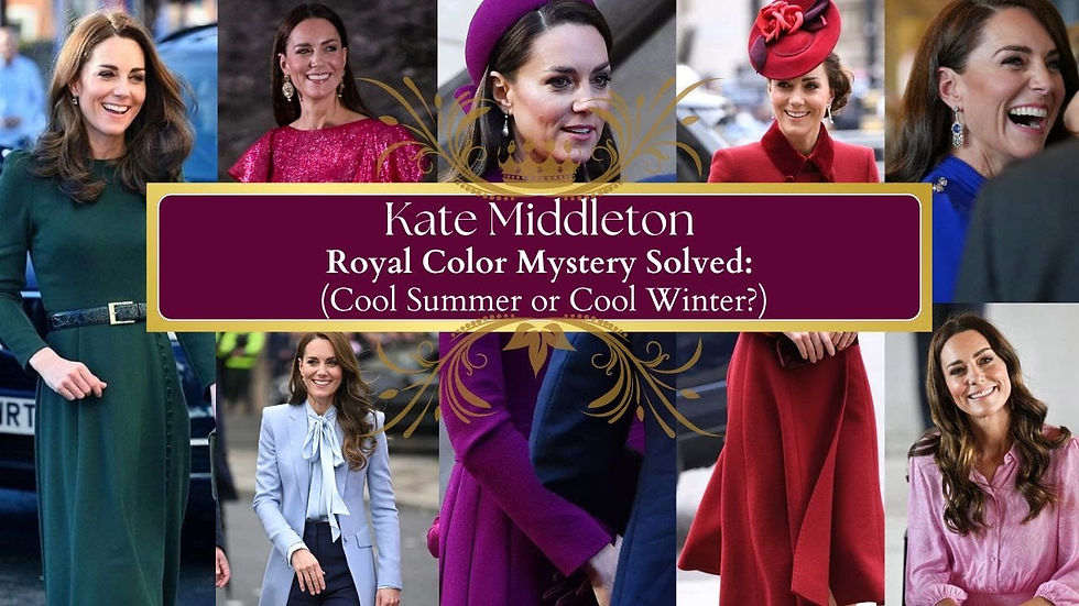
Kate Middleton Color Season
(Cool Summer and Cool Winter)
The Sister Season Connection

If Kate is indeed best understood as a Cool Summer, this purple gown is a perfect example of how sister seasons can influence one another.
Cool Summer and Cool Winter share the same important foundation:
They are both cool.
That means both palettes are generally flattered by blue-based colors, icy undertones, cool pinks, berries, plums, violets, mauves, and blue-reds.
The difference is usually intensity.
Cool Summer is softer, more refined, and more muted. Cool Winter is deeper, clearer, sharper, and more high contrast.
So when a Cool Summer borrows from Cool Winter, she needs to be mindful of depth, brightness, makeup, hair color, and fabric finish, and we'll look more closely at this in a moment.
A Cool Summer Woman of Style, such as the lovely Kate Middleton, can often wear deeper cool colors beautifully when the color still has elegance and softness. This is why amethyst, violet, cool plum, and blue-based purple can work so well. However, the trick to crossing over into the slightly, more intense palette of cool winter is to find balance.
But if the purple becomes too electric, too blackened, too harsh, or too saturated, it can begin to overpower a Cool Summer woman.

This is why Catherine’s purple gown works better than many people may realize.
The color is rich, but not neon.
The fabric has softness and movement, which can change the visual look of the actual colors. The neckline softly opens the face.The silver and amethyst jewelry support the coolness. The overall look still has elegance, not harshness.
That is the key.
She is borrowing subtle hints of drama from Cool Winter, but the styling still allows her Cool Summer refinement to come through.
The Hair Color Detail: Golden Chestnut vs. Cooler Brunette
This is where the look becomes especially interesting from a color consultant’s perspective.
In the original premiere photo, Catherine’s hair appears slightly warmer and more golden chestnut than the deeper cool brunette shades many of us associate with her earlier public years and quite frankly her most flattering, natural hair color in my professional opinion.
That warmer chestnut tone is not unattractive. It softens her. It gives warmth to the face. It may even feel more approachable and modern.
However, when she is wearing a cool purple gown with cool-toned jewellery, the warmer hair creates a subtle temperature contrast. This may be one reason many colour enthusiasts and consultants online continue to debate whether she is actually a warmer colour season, such as an Autumn, which is a fair observation.

But this is also where we have to look beyond the effects of professional styling, lighting, hair colour, makeup, and the overall royal/Hollywood makeover machine. Those elements can dramatically influence a woman’s visual aesthetic - and her stylist have done a beautiful job. However, when properly analysed it becomes more evident that Kate Middleton’s strongest signature colours appear to sit within the Cool Summer and Cool Winter family.
The dress is cool.
The jewelry is cool.
The overall evening palette is cool.
But Kate Middleton’s hair reads slightly warmer here, and that is where the harmony shifts. The warmth in her hair creates a subtle disconnect against the coolness of the purple gown, which leans more into the Cool Winter palette.
This does not ruin the look, but it does change the harmony.
When her hair is revised to a deeper, cooler brunette brown, the entire visual story becomes more coherent.
The cooler brunette creates a stronger relationship between her hair, brows, eyes, gown, and jewelry.
And let me be clear, Kate looks stunning! However, a slight tweak of hair color does make a noticeable difference in the harmony of colors. I just wanted to show you that the smallest shift in hair temperature can affect the way a color palette comes together.

For women watching this from a personal style perspective, this is an important style tip.
Your hair color is part of your color palette. Whether worn in braids, cornrows, lustrous stresses or a French braid.
It affects your clothing.
It affects your makeup.
It affects how polished or disconnected an outfit feels.
This is why color analysis should never be reduced to a simple seasonal label. Your best colors need to be understood in relationship to your hair, skin, eyes, contrast, lifestyle, and image goals.
What Cool Summer Women Can Learn From This Look
If you are a Cool Summer woman, Catherine’s purple gown offers a beautiful color and style tip in how to wear stronger colors without losing your softness.
You do not need to stay only in powder blue, dusty rose, soft mauve, lavender, or muted grey that can become a bit boring and why I feel at times Kate Middleton tends to mix things up a bit between the two cool seasonal palettes; hence why one is signature, primary palette and the other your flow/sister color season.
Those colors may be beautiful on you, but you also have the ability to explore deeper cool shades when styled with intention.
Consider shades such as:

• Amethyst
• Cool plum
• Soft violet
• Blue-based purple
• Smoky berry
• Cool raspberry
• Rosewood
• Soft wine
• Deep mauve
• Muted royal purple
The secret is to avoid extremes.
You want depth without heaviness.
You want richness without harshness.
You want coolness without looking drained.
You want elegance without letting the color wear you.
This is where makeup becomes important as well.
A Cool Summer wearing a deeper purple may need a soft berry lip, a cool rose blush, defined lashes, and polished brows to support the strength of the color. If the face is too bare, the color may feel heavy. If the makeup is too dramatic, it can push the look into Cool Winter territory too aggressively.
Balance is everything and Kate Middleton does this beautifully.
Why This Look Feels So Regal
What makes Catherine’s purple premiere look so successful is not only the color.
It is the complete image message and one I speak about in this companion article
The gown has movement.
The jewelry has heritage. (Watch my Classic Elegant Woman of Style video)
The purple has royal symbolism. (Watch my Old Money Women of Style video)
The styling feels formal, but not severe.
The overall effect feels elegant, cinematic, and very much aligned with her role.
This is where color becomes more than personal preference.
Color becomes communication.
A purple gown at a major film premiere says something different than black, white, red, or navy; Which I might add Kate Middleton has worn in the past quite beautifully.
Black may have felt sleek and formal.
White may have felt fresh and luminous.
Red may have felt bold and commanding.
Navy may have felt safe and diplomatic.
Purple created a more layered message.
It was regal, feminine, expressive, and memorable.
For a woman in a public role, especially one connected to tradition, symbolism, and national identity, purple can communicate authority with softness. It has presence, but it does not need to shout.
That is why this look feels so aligned with the Renaissance Woman of Style philosophy.
The goal is not just to wear a beautiful dress.
The goal is image alignment. (Join the RWS 5-Day Feminine Reset Experience)
My Final Thoughts
Catherine’s purple Jenny Packham gown is a wonderful study in color intelligence because it shows how a woman can borrow from a sister season without losing herself in a color palette that doesn't work with her visual presence and lifestyle.
If we view her through a Cool Summer lens, this look demonstrates how deeper Cool Winter colors can still work when the undertone is right, the styling is refined, and the overall harmony is considered.
The original warmer chestnut hair gives the look softness, but the revised cooler brunette version creates stronger color harmony with the gown and jewelry.
That is the power of color analysis.

It is not about rigid rules.
It is about refinement.
It is about seeing the small details that change the whole impression.
It is about understanding why one version of a look feels good, while another feels even more aligned.
For Cool Summer women, this is your reminder that your palette is not limited to softness alone.
You can wear depth.
You can wear subtle drama.
You can borrow from Cool Winter.
You simply need to keep the harmony cool, elegant, and intentional.
And as Kate Middleton shows us here, the right purple can become more than a beautiful color.
It can become a statement of regal presence.
Look forward to receiving your comments below, happy Autumn season 🍂
Uncertain about which style personality aligns best with your lifestyle, career goals, and personal branding message? I encourage you to consider the RWS Color & Style Rebrand Intensive. In this online package, we will collaborate closely in a virtual setting
to redefine your personal brand.


The fabric-finish point is more useful to me than the season label on its own. Before choosing fabric for one of Sewlore’s evening-dress designs, I’d compare a matte and a more lustrous swatch in a similar purple. The colour might appeal in both, but the dress could feel quite different. A small swatch beside the intended accessories would be a helpful next step.